here is just an email my client sent me.
Dear Boysie,


Thanks for your first draft designs - a good start considering the lack of a precise brief from me. You've now stimulated some more precise thinking from me so here goes:
Values:

Emerging values are; SERVICE, VALUE, QUALITY, SUSTAINABILITY. There will be more values but for the time being let's concentrate on these.
Positioning:

PREMIUM, we will still offer very good value for money but we want to move dramatically away from Tudor Chips which is essentially cheap and cheerful.


So for example, if we were:
A CAR - We'd be a BMW not a Ford
A DESIGNER - Hugo Boss not Top Man
A DOG - A Labrador not a mongrel
These are also emerging thoughts which we will refine over time but it's better than no brief at all.
Typography:

The type face you've used looks pretty spot on, but it would be nice to see some alternatives for choice and comparison.
Shield:

I've called it a shield because that's exactly what it is. We think we want a crest rather than a shield or a coat of arms. A good point of reference would be the Duchy Foods web site. We like their crest it's a very clean design, premium and memorable.
Can you please give the design some further thought in the light of the above - thank you.


If I could have your further thoughts with some colour combinations by Friday, that would be most helpful. You might also want to consider how this would look on stationery, signage on the side of the warehouse and on the vans.
Thank you

Brian
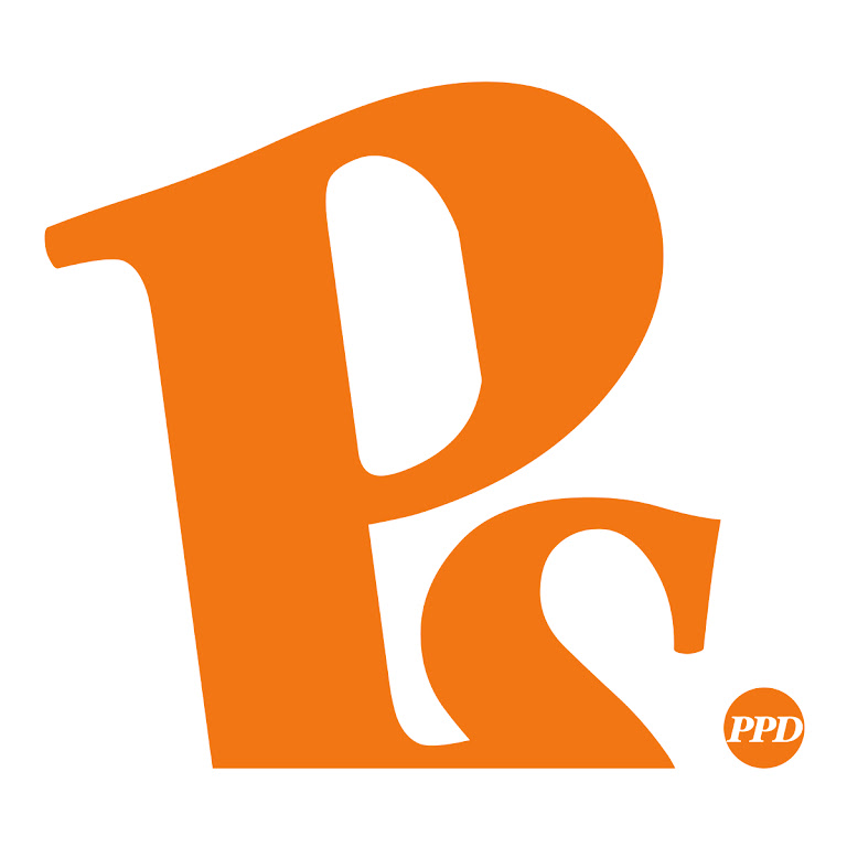
Final logo

Was he pleased?I've never seen anyone happier. Now Brian,sings your praises to anyone who'll listen
ReplyDelete